Programmes clarified, applications up.
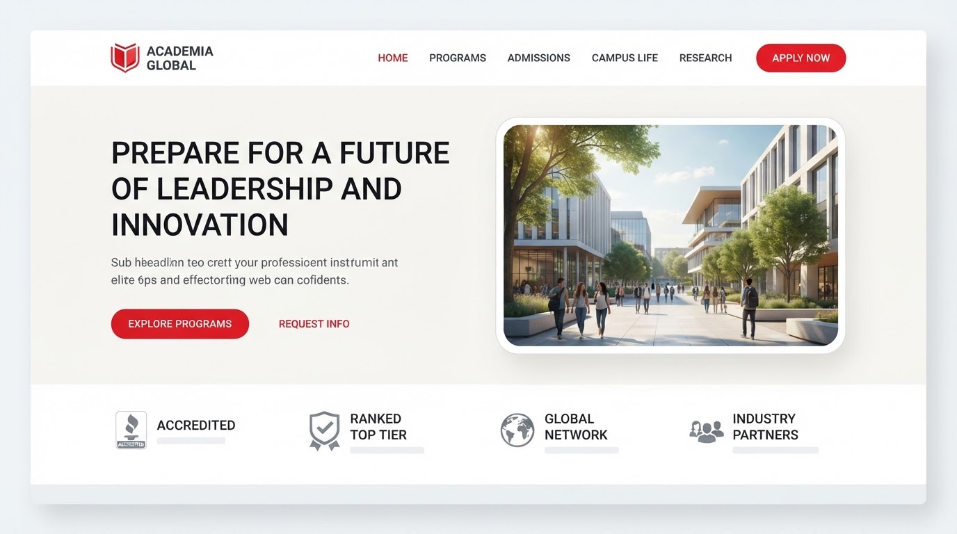
Brioia is an education provider whose programmes read as a wall of text. Prospects couldn't tell one from another, and applications suffered for it.
The brief
What the client came with
Brioia is an education provider whose programmes read as a wall of text. Prospects couldn't tell one from another, and applications suffered for it.
The challenge
The design problem to solve
Make a suite of programmes legible and distinct — bilingually — and make applying the obvious end of the page.
The approach
Research, wireframes, style
Research
We interviewed admissions and mapped where prospects dropped off. The confusion was structural, not promotional.
Wireframes
A clean, trustworthy grid with clear zones for proof, programme and the apply action.
Style exploration
Corporate refined: a neutral display, a highly legible body, restrained professional palette, red on the CTAs.
The build
Key screens, responsive, motion
Key screens
Home, programmes, programme detail, admissions, apply and a bilingual switch — twenty-six templates.
Responsive
Programme comparison reflows to a stacked card on mobile so a family can compare on one phone.
Motion
Subtle fades and measured hover lifts — confident, never noisy.
The results
What changed, measured
·
·
Client
In their words
“They didn't just design pages — they designed how the business reads online. The difference showed in the first month.”
Takeaways
What we'd keep
- 01Structuring programmes by outcome, not by faculty, lifted applications.
- 02A bilingual switch served two households from one source of truth.
- 03A pinned apply action turned interest into a started application.
Next case study
A configurator-style showcase that drove showroom visits.
Solar · Automotive · 2024