← All 100 websites
SaaS & Technology/Organic & Tactile/Redesign
Brioante
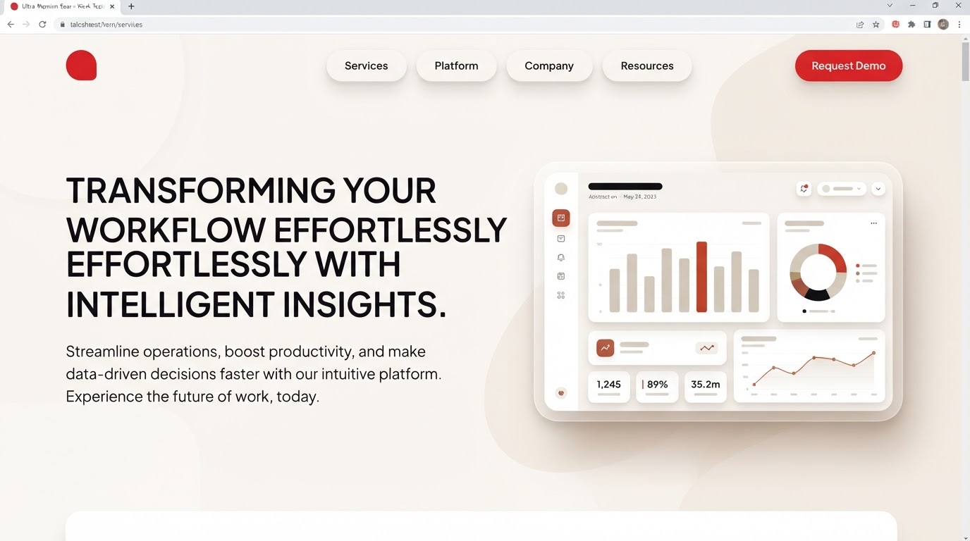
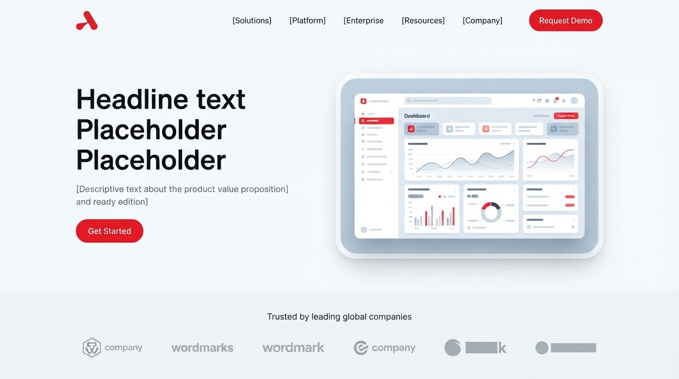
A product site that lifted trial signups and explained a complex platform in one scroll.
brioante.ae
The challenge
An aging redesign for Brioante buried a strong offering under slow pages, unclear navigation and a brand story that never quite landed online. The priority was to make the work unmistakable in the first scroll and effortless to act on.
The design solution
Layout
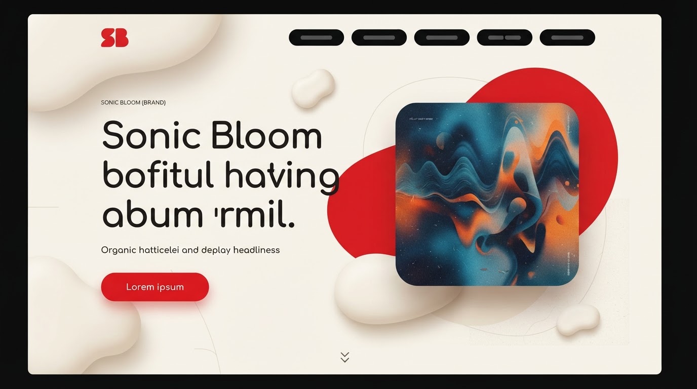
Soft, asymmetric shapes and rounded containers over warm surfaces.
Typography
A humanist display with gentle curves and relaxed leading.
Colour
Warm neutrals with red introduced as an earthy accent.
Motion
Soft, organic easing and floating elements.
Features built
- Responsive design
- Motion design
- Design system
- Multilingual (EN / AR)
- Accessibility (WCAG AA)
- Performance optimisation
Verified results
·
·
Client quote
“They didn't just design pages — they designed how the business reads online. The difference showed in the first month.”