Patients routed to the right clinic, fast.
Mesain is a healthcare group whose patients landed on a directory and left. The brief was a calm site that put people in front of the right clinician quickly.
The brief
What the client came with
Mesain is a healthcare group whose patients landed on a directory and left. The brief was a calm site that put people in front of the right clinician quickly.
The challenge
The design problem to solve
Be warm and trustworthy enough to use when you're unwell — and structured enough to route a visitor to the right clinic without a phone call.
The approach
Research, wireframes, style
Research
We mapped the ten most common reasons people contact the group and built the navigation around those, not the org chart.
Wireframes
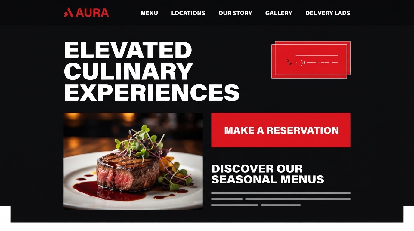
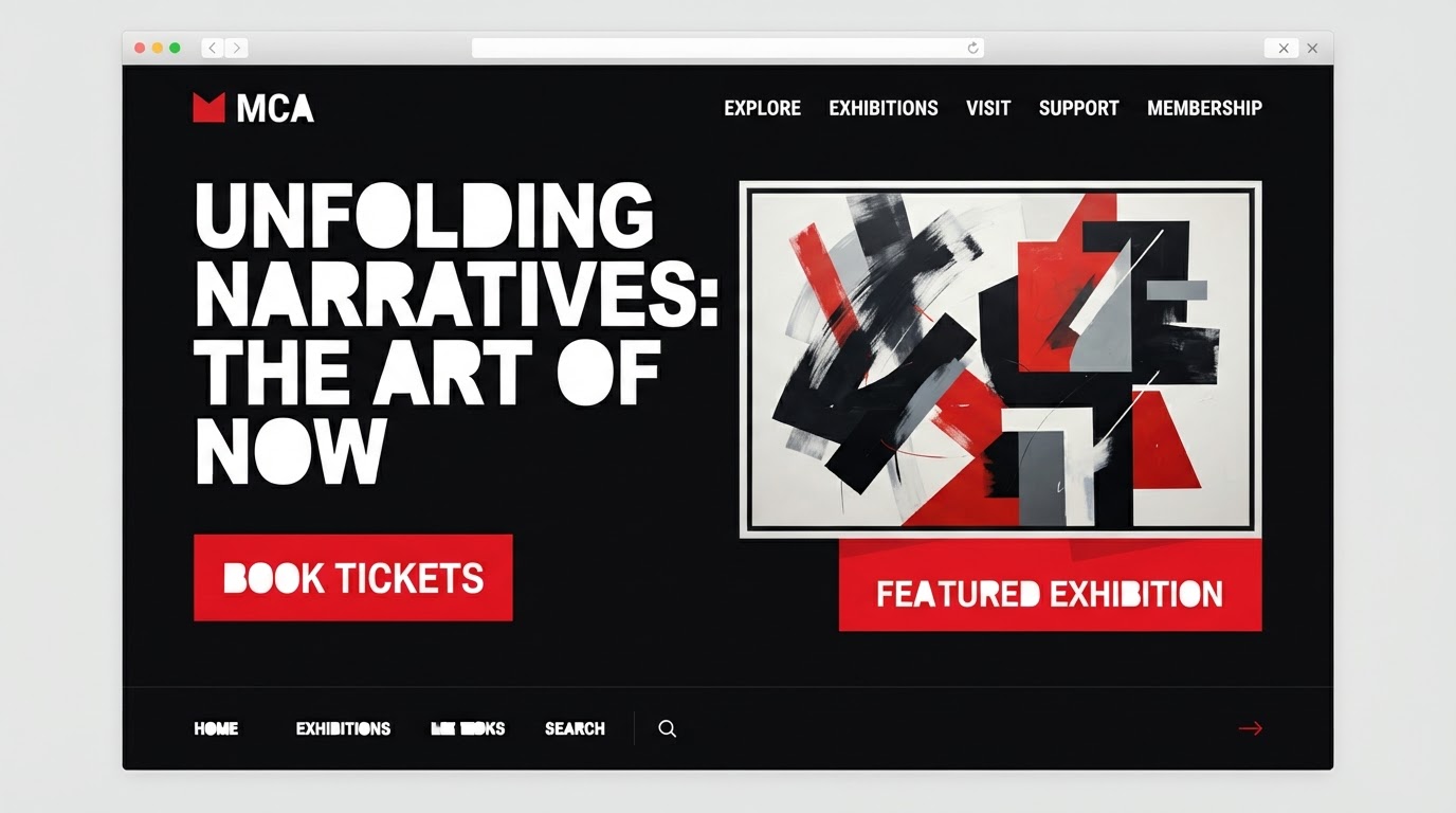
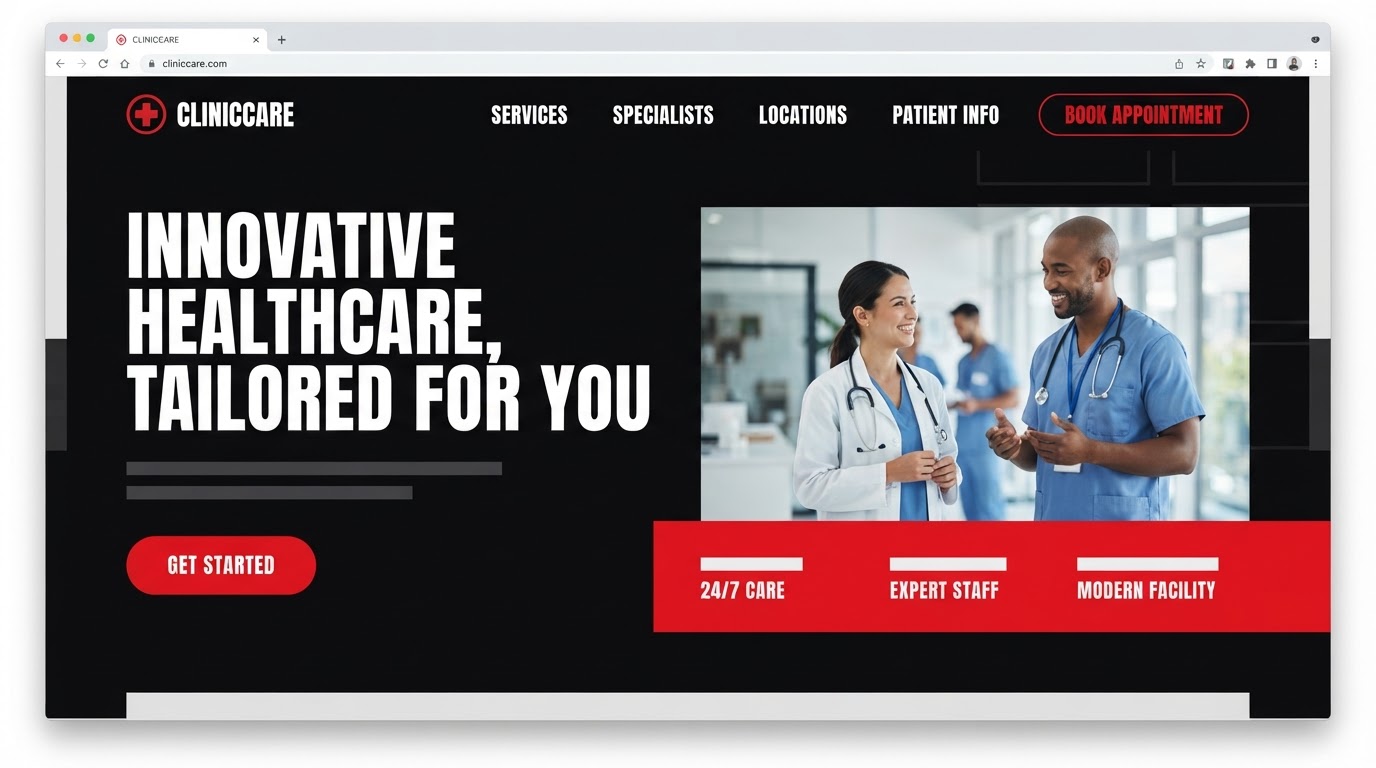
Bold blocks of type and image with strong figure-ground separation and the booking action never far from the answer.
Style exploration
High-contrast: a heavy display against an even body, ink and paper, red blocking the key calls to action.
The build
Key screens, responsive, motion
Key screens
Home, clinics, services, booking, patient info and a contact directory — nineteen templates.
Responsive
The booking action pins to the bottom on mobile and re-anchors to the nearest clinic card on tablet.
Motion
Hard reveals and confident hover inversions — the site behaves the way a good reception does.
The results
What changed, measured
·
·
Client
In their words
“Search rankings climbed within weeks of launch — the speed work paid for itself.”
Takeaways
What we'd keep
- 01Routing by reason, not by department, cut the time to the right clinician.
- 02Calm, high-contrast type earned trust without softening the brand.
- 03An always-visible booking action turned intent into an appointment.
Next case study
Programmes clarified, applications up.
Brioia · Education · 2025