Cielora
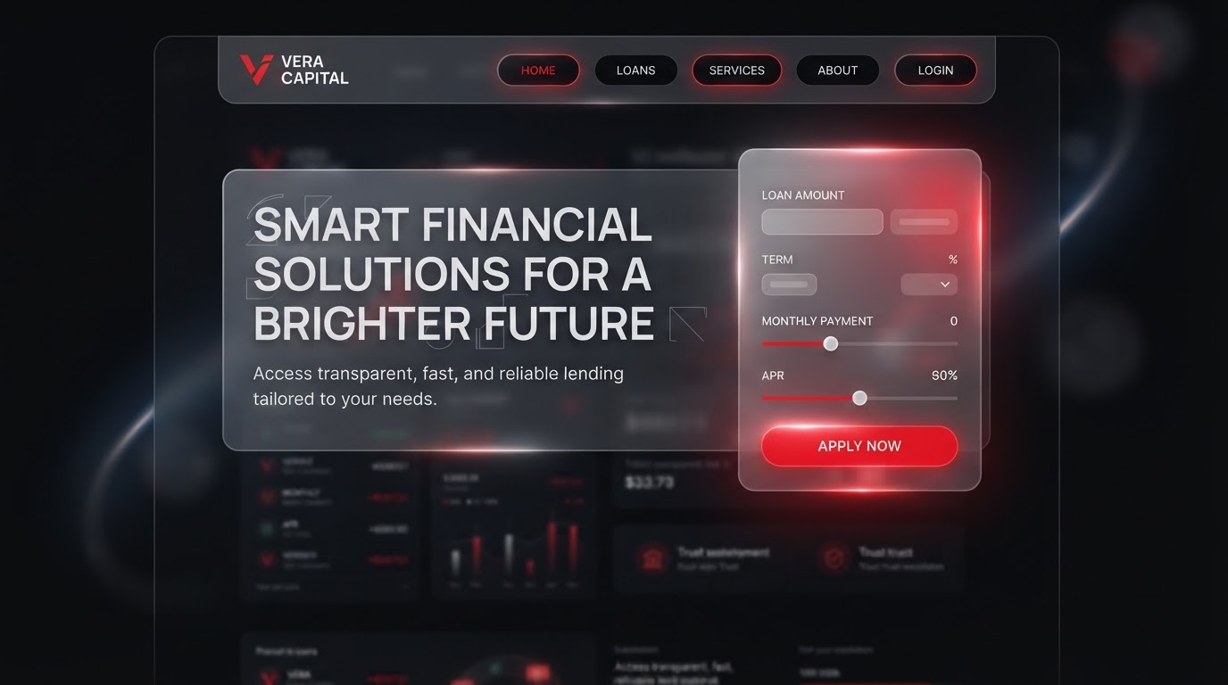
A trust-first site that doubled qualified leads for a lending product.
The challenge
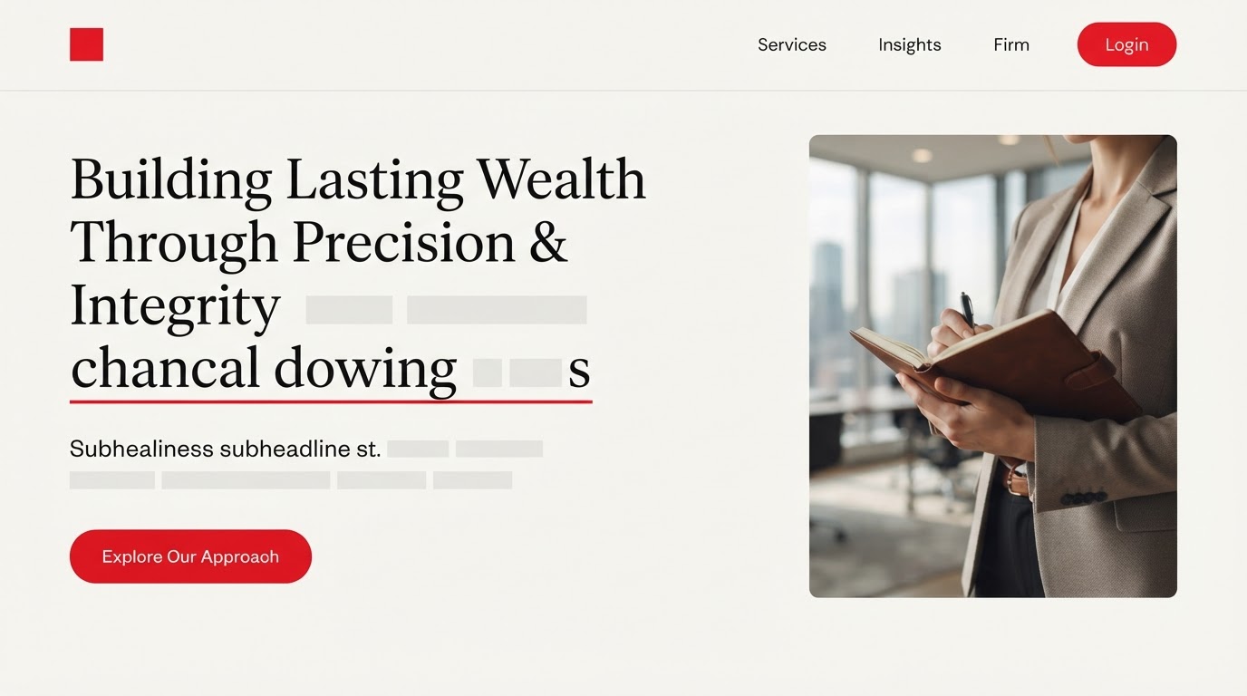
An aging redesign for Cielora buried a strong offering under slow pages, unclear navigation and a brand story that never quite landed online. The priority was to make the work unmistakable in the first scroll and effortless to act on.
The design solution
Layout
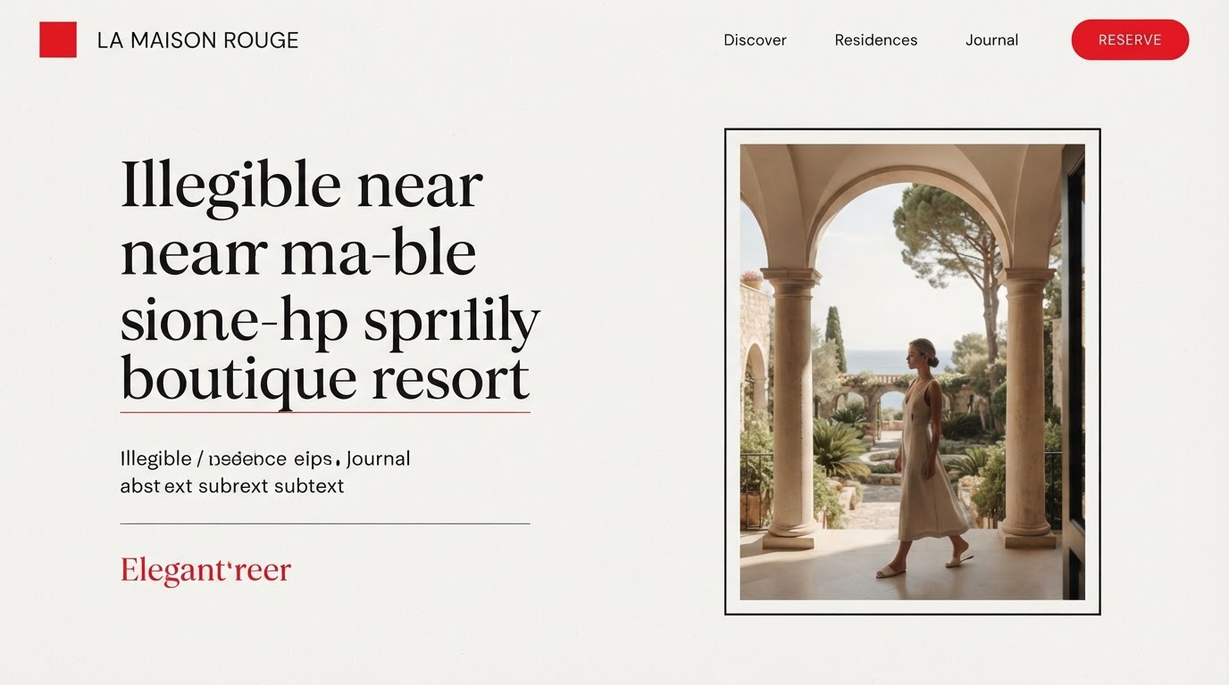
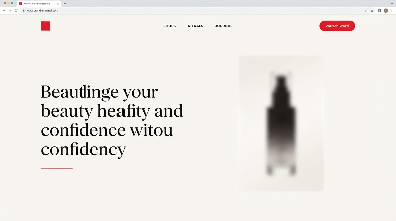
A generous, type-led grid with long-form whitespace and a single column of attention.
Typography
A confident display weight paired with a quiet body, tightened tracking on headlines.
Colour
A near-monochrome surface with one restrained red used only for action and accent.
Motion
Slow fades and clip-path reveals that let the work breathe between sections.
Features built
- Responsive design
- Motion design
- Design system
- E-commerce
- Accessibility (WCAG AA)
- Performance optimisation
Verified results
·
·
Client quote
“Clear, fast and unmistakably ours. Enquiries got sharper and faster from week one.”