← All 100 websites
Renewable Energy/Brutalist/New build
Lumeara
A technical site that made a clean-energy story legible to investors.
lumeara.ae
The challenge
An aging website for Lumeara buried a strong offering under slow pages, unclear navigation and a brand story that never quite landed online. The priority was to make the work unmistakable in the first scroll and effortless to act on.
The design solution
Layout
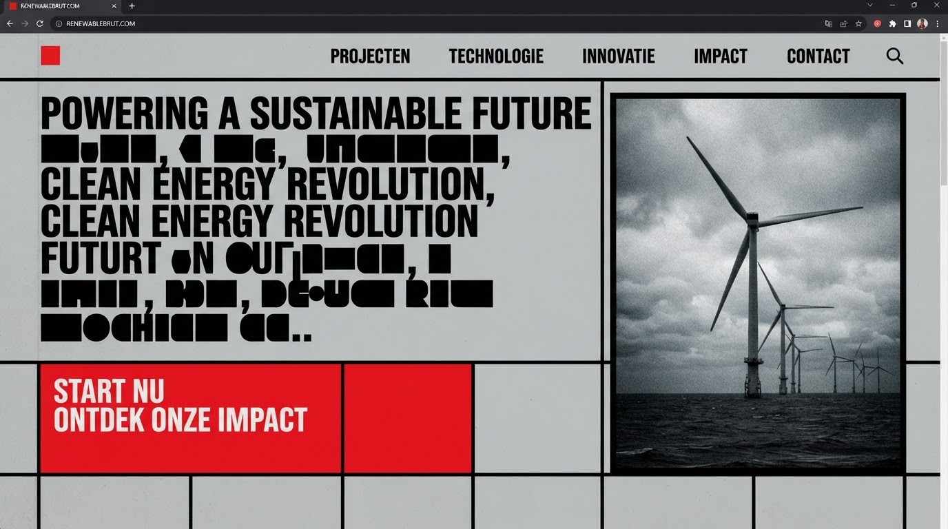
An exposed grid with hard offsets, visible structure and deliberate tension.
Typography
Heavy, oversized display type set tight against the edge of the viewport.
Colour
High-contrast ink and paper with red reserved for wayfinding and state.
Motion
Snappy, mechanical transitions with no easing softness.
Features built
- Responsive design
- Scroll storytelling
- Design system
- Membership portal
- Accessibility (WCAG AA)
- Performance optimisation
Verified results
·
·
Client quote
“The redesign paid for itself before the quarter closed.”