← All 100 websites
Real Estate/Maximalist/New build
Meré
An availability-led site that shortened the sales cycle for off-plan units.
mer.ae
The challenge
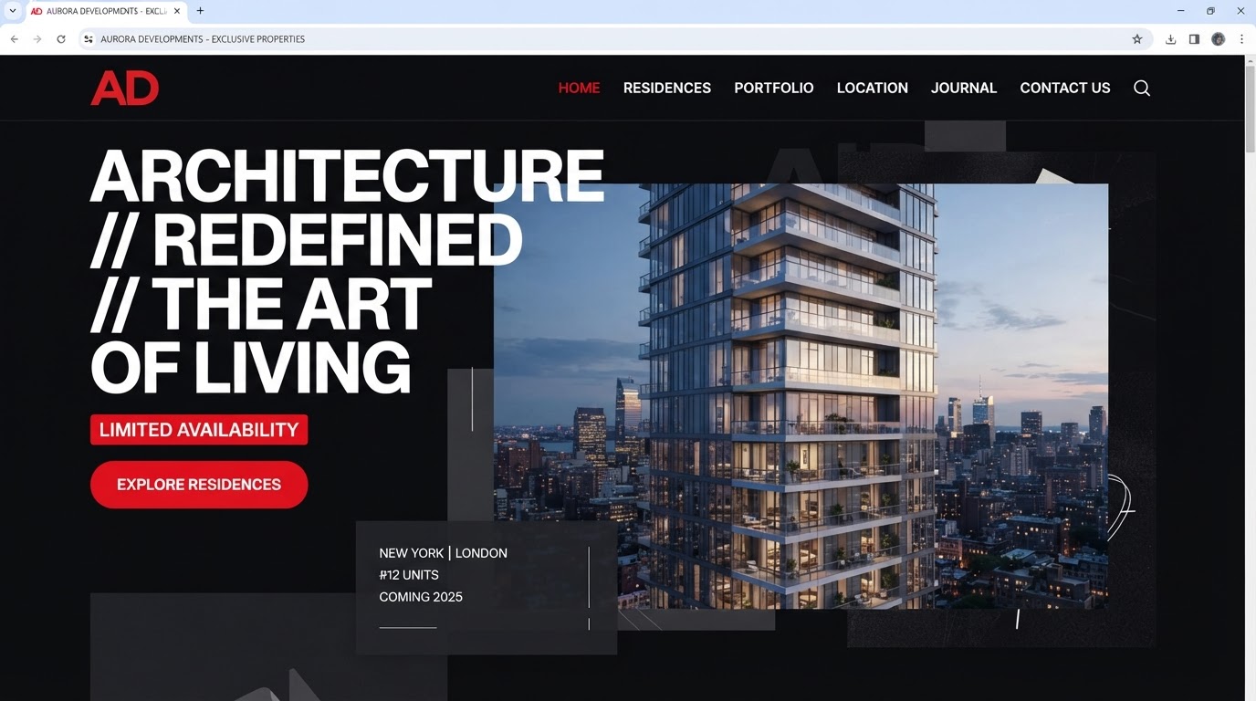
An aging website for Meré buried a strong offering under slow pages, unclear navigation and a brand story that never quite landed online. The priority was to make the work unmistakable in the first scroll and effortless to act on.
The design solution
Layout
A layered, full-bleed composition that stacks type, image and colour with intent.
Typography
Mixed weights and sizes used as texture, not hierarchy alone.
Colour
A saturated palette anchored by brand red and deep neutral shadows.
Motion
Parallax and staggered reveals that reward scrolling.
Features built
- Responsive design
- Motion design
- CMS integration
- Multilingual (EN / AR)
- Accessibility (WCAG AA)
- Performance optimisation
Verified results
·
·
Client quote
“Bookings moved online and the front desk finally got their evenings back.”