← All 100 websites
Real Estate/Warm Editorial/Redesign
Otraos
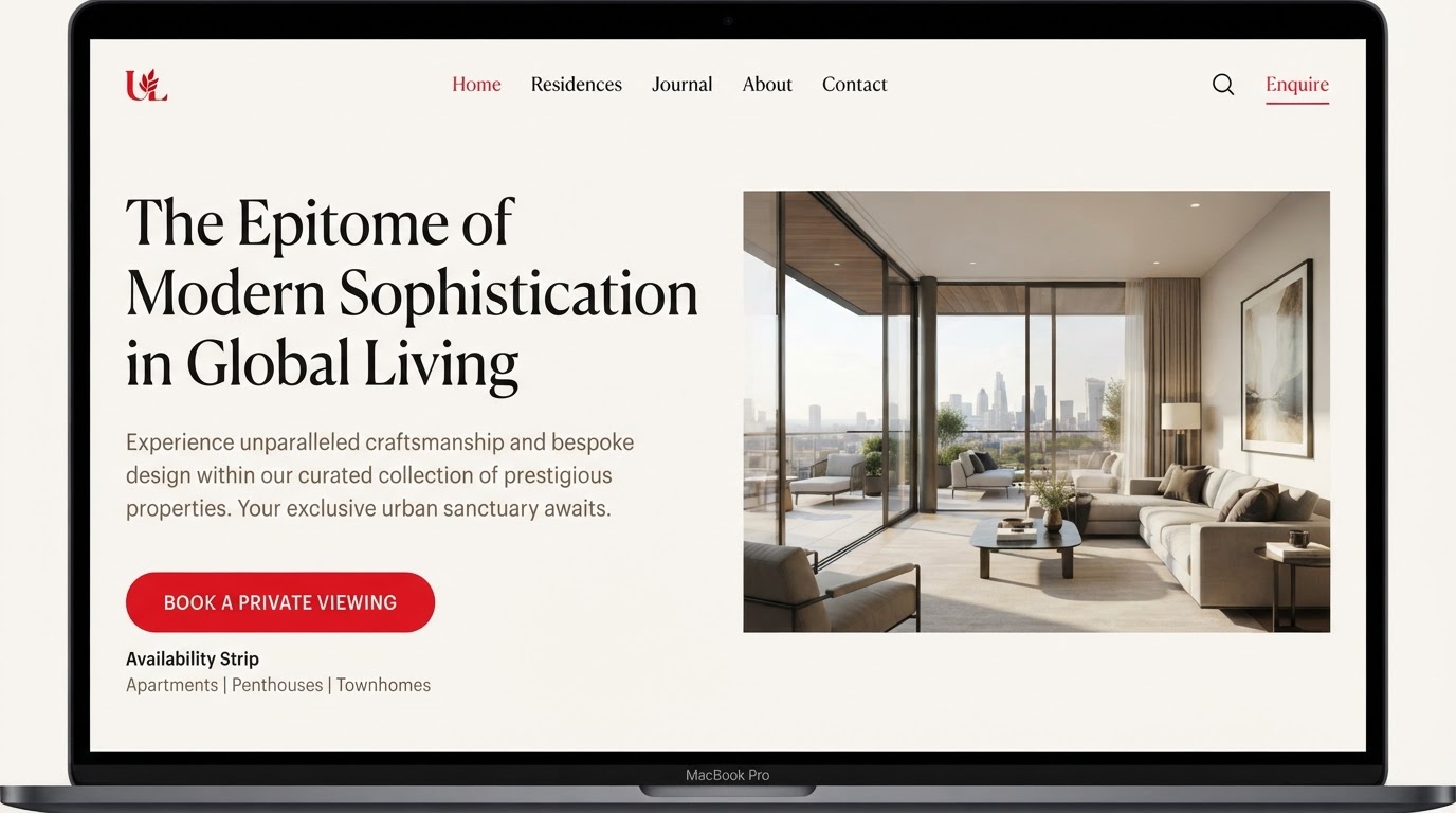
An availability-led site that shortened the sales cycle for off-plan units.
otraos.ae
The challenge
An aging redesign for Otraos buried a strong offering under slow pages, unclear navigation and a brand story that never quite landed online. The priority was to make the work unmistakable in the first scroll and effortless to act on.
The design solution
Layout
A magazine-style flow with pull quotes, columns and captioned imagery.
Typography
A classic serif display over a calm sans body.
Colour
Warm paper tones with red underlines and markers.
Motion
Section-to-section pacing that reads like a spread.
Features built
- Responsive design
- Motion design
- CMS integration
- Multilingual (EN / AR)
- Accessibility (WCAG AA)
- Performance optimisation
Verified results
·
·
Client quote
“They didn't just design pages — they designed how the business reads online. The difference showed in the first month.”