← All 100 websites
Travel & Tourism/Swiss Grid/New build
Mere
An itinerary-rich site that lifted direct bookings over agencies.
mere.ae
The challenge
An aging website for Mere buried a strong offering under slow pages, unclear navigation and a brand story that never quite landed online. The priority was to make the work unmistakable in the first scroll and effortless to act on.
The design solution
Layout
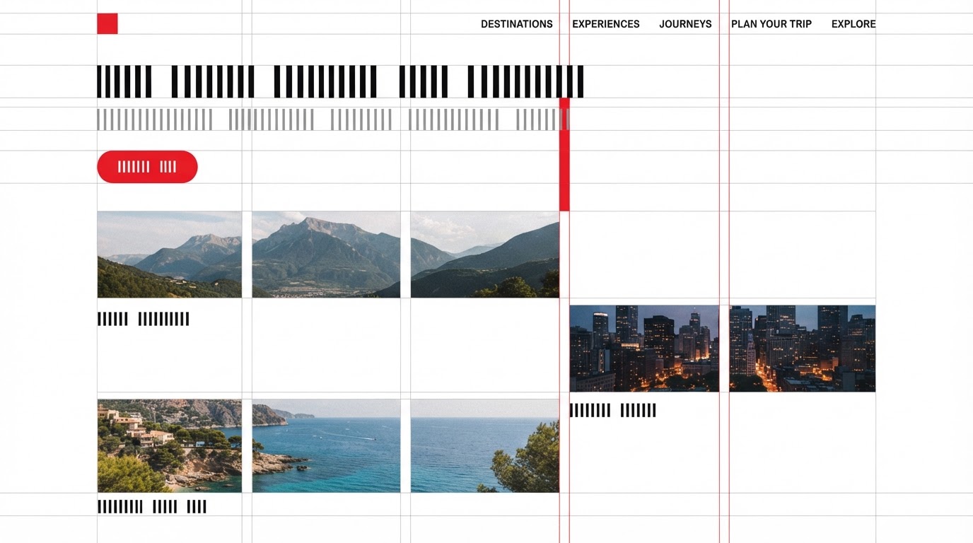
A rigorous modular grid with strict baseline alignment and clear zones.
Typography
A neutral grotesque with precise hierarchy and consistent leading.
Colour
A restrained ink-and-paper palette with red as the only accent.
Motion
Grid-locked reveals that snap content into place.
Features built
- Responsive design
- Scroll storytelling
- CMS integration
- Membership portal
- Accessibility (WCAG AA)
- Performance optimisation
Verified results
·
·
Client quote
“Search rankings climbed within weeks of launch — the speed work paid for itself.”