Direct bookings up, third-party fees down — in the first quarter.
Brioin Group runs a boutique resort that relied on listing platforms for the bulk of its reservations. Direct traffic was leaking to intermediaries, and the old site did nothing to earn it back.
The brief
What the client came with
Brioin Group runs a boutique resort that relied on listing platforms for the bulk of its reservations. Direct traffic was leaking to intermediaries, and the old site did nothing to earn it back.
The challenge
The design problem to solve
The previous site buried the property under slow, image-heavy pages and an unclear booking path. Visitors landed, skimmed, and left for an aggregator. We needed the first scroll to sell the stay and the booking flow to be the shortest path on the page.
The approach
Research, wireframes, style
Research
We audited three months of booking data and exit pages, then mapped the guest journey from search to confirmation. Most drop-offs happened between the hero and the rooms — the old site never connected the two.
Wireframes
A single-column content flow leads with the property, narrows to room types, then lands on a sticky booking strip that follows the visitor down the page.
Style exploration
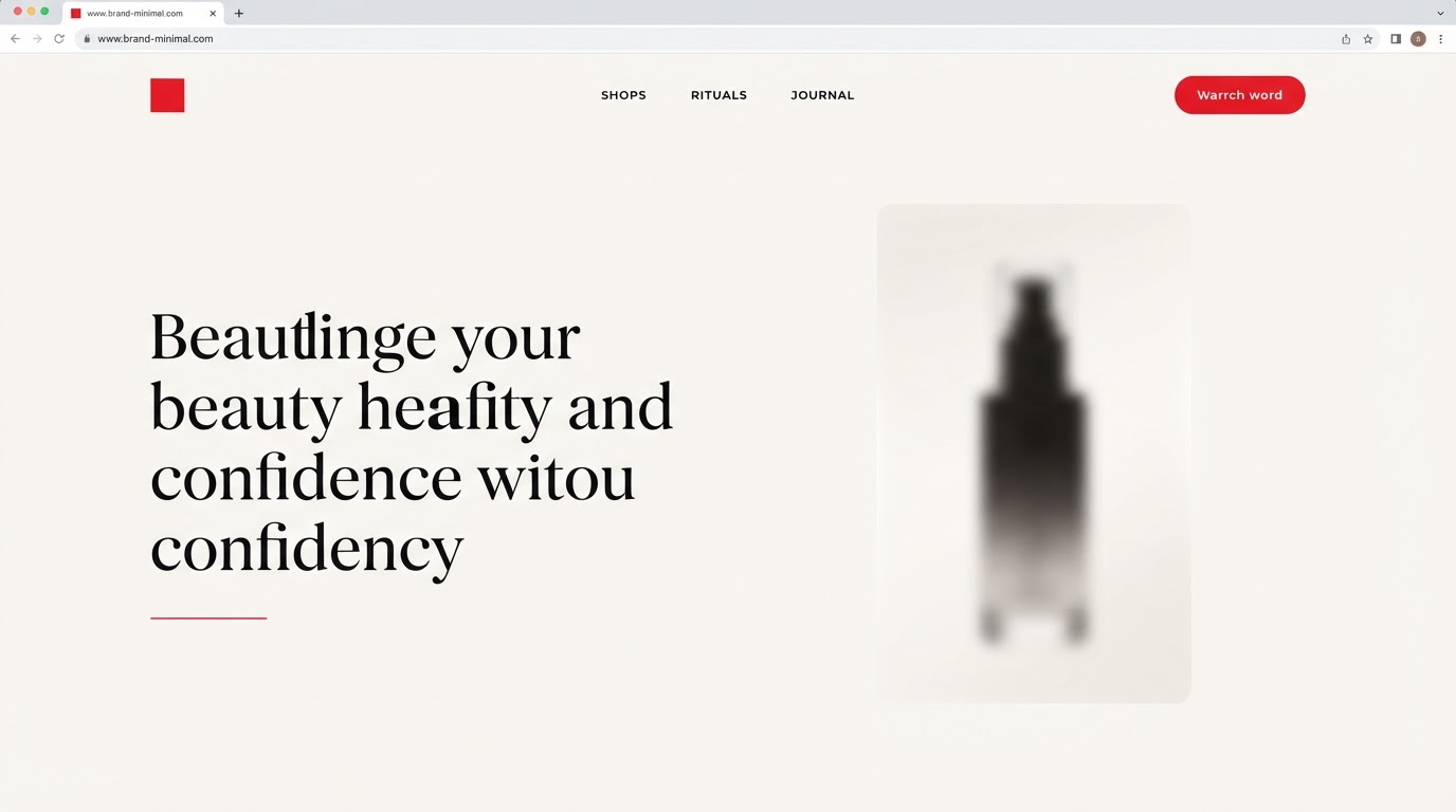
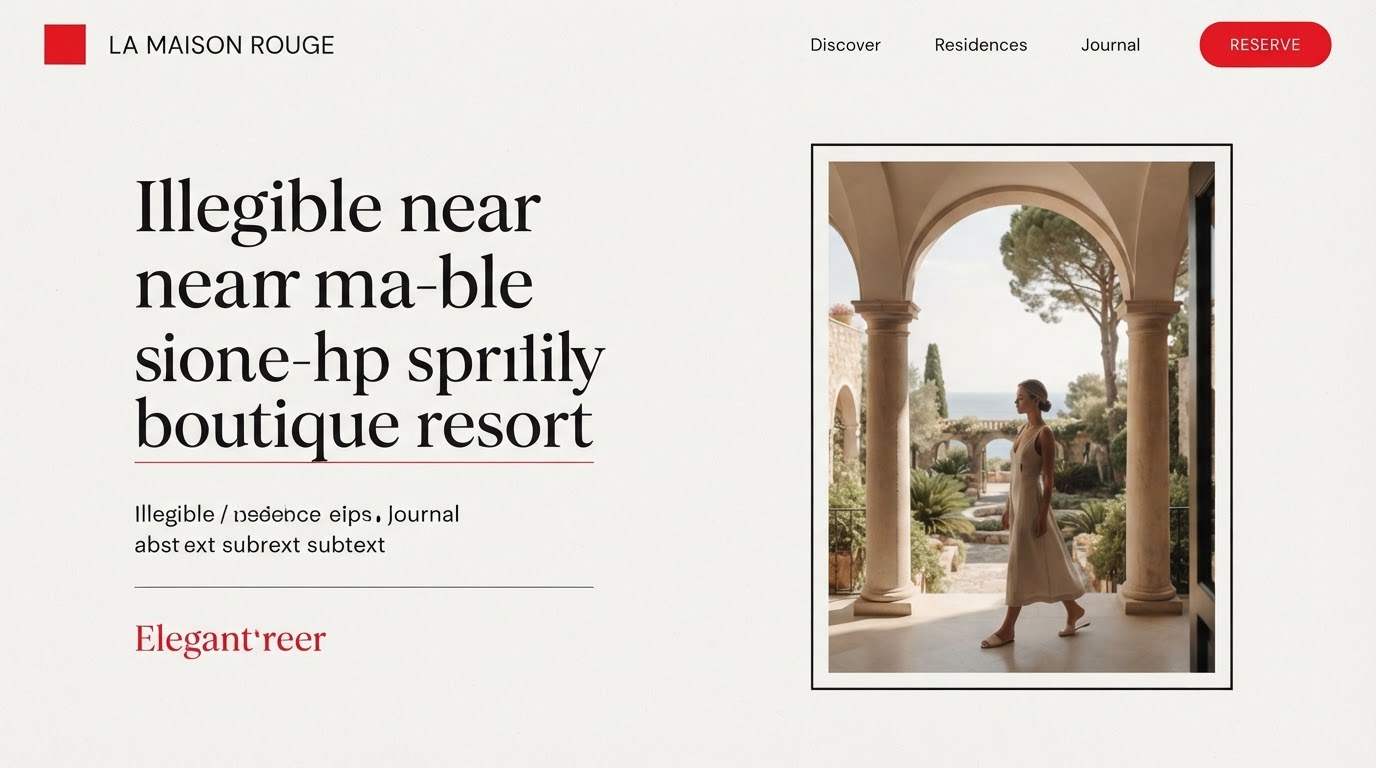
Editorial minimal: long-form whitespace, one restrained accent, and a near-monochrome surface so the photography carries the story.
The build
Key screens, responsive, motion
Key screens
Home, rooms, a single-page booking flow, and a contact strip. Four templates, one system.
Responsive
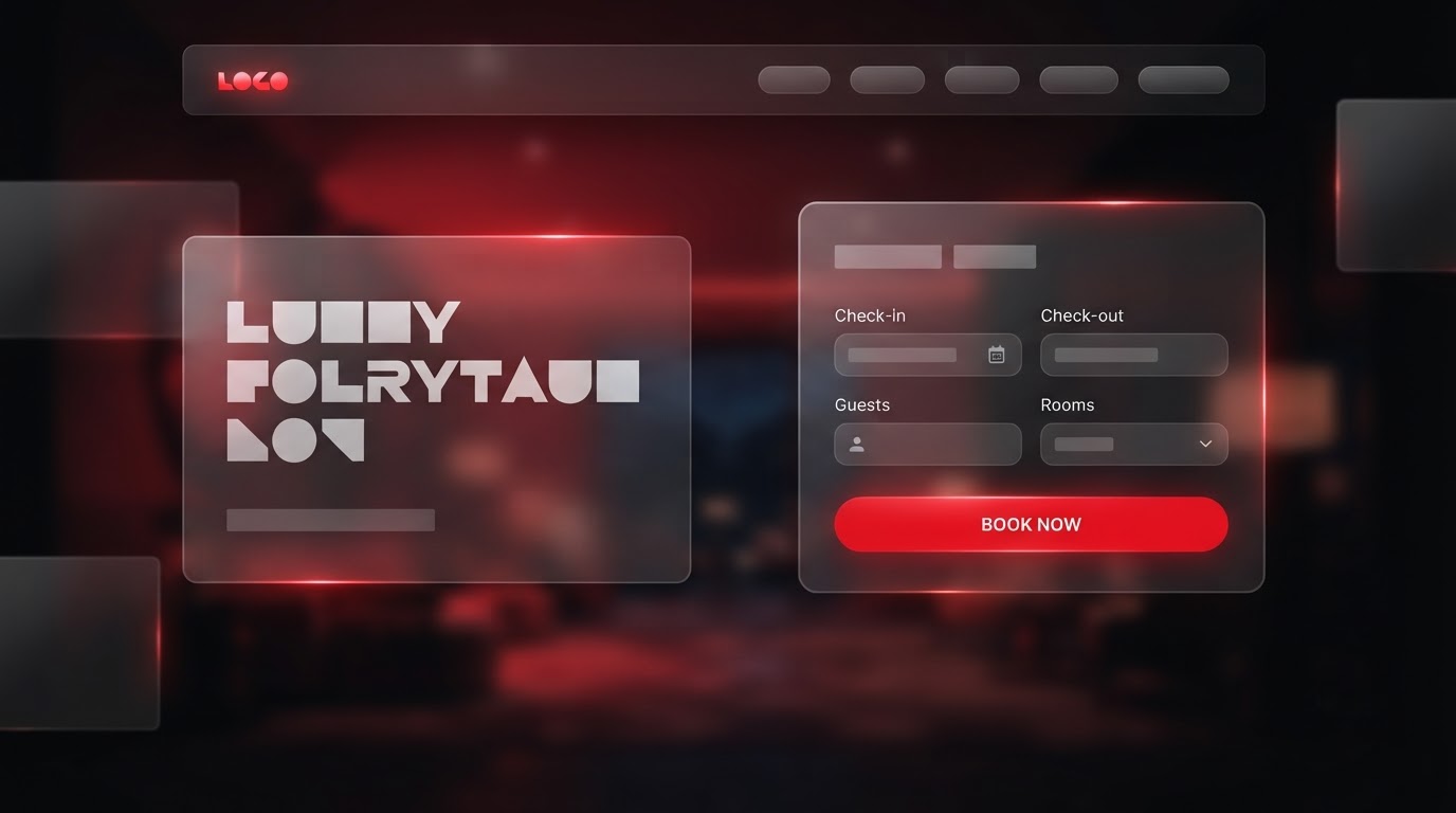
The booking strip collapses to a pinned bottom bar on mobile and re-anchors to the room imagery on tablet, so the call to action never disappears below the fold.
Motion
Slow clip-path reveals between sections and a quiet image crossfade on the room gallery — movement that lets the photography breathe.
The redesign
Before, and after
Drag the handle to compare the old site against the redesign — the captures below are the real pages, old and new.
The results
What changed, measured
·
·
Client
In their words
“They didn't just design pages — they designed how the business reads online. The difference showed in the first month.”
Takeaways
What we'd keep
- 01A sticky booking strip cut the distance from interest to action to a single tap.
- 02Editorial whitespace let the property photography do the selling.
- 03Reducing page weight lifted load speed, which lifted rankings and direct visits.
Next case study
A reservations-first site that filled seats and cut booking fees.
Monteo · Restaurants & Cafés · 2024