A reservations-first site that filled seats and cut booking fees.
Monteo is a reservations-led restaurant paying third-party platforms a fee per cover. The goal was a site that earned reservations directly and made the menu feel like an invitation, not a PDF.
The brief
What the client came with
Monteo is a reservations-led restaurant paying third-party platforms a fee per cover. The goal was a site that earned reservations directly and made the menu feel like an invitation, not a PDF.
The challenge
The design problem to solve
The brand had warmth and a strong visual identity offline, but no online presence worth the name. The site needed to feel like the room — and to convert a browser into a booked table in two taps.
The approach
Research, wireframes, style
Research
We studied the room in service: the light, the menu cadence, the way staff described dishes. The site had to sound like that, not like a booking widget.
Wireframes
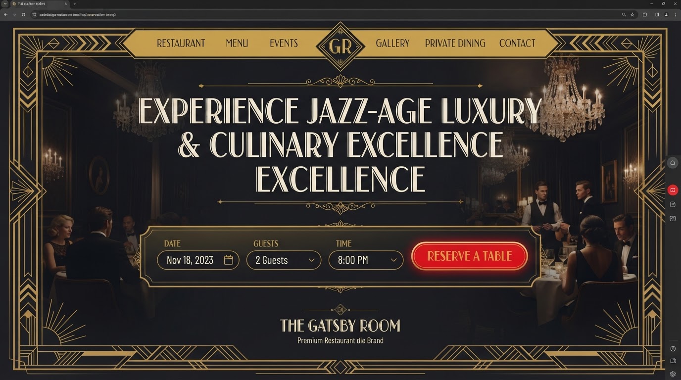
A symmetrical, framed layout with the reservation flow centred and the menu set as a reading column either side of it.
Style exploration
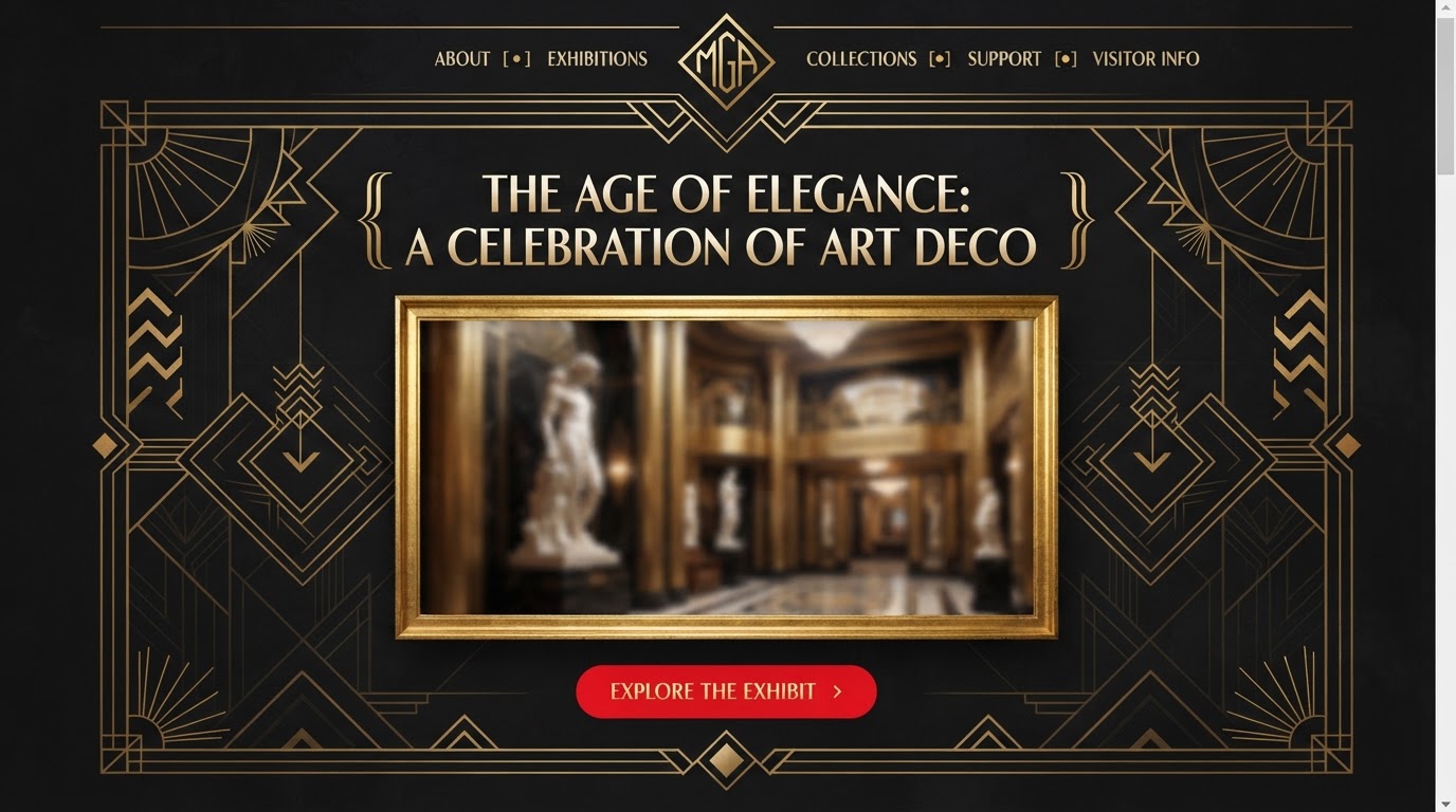
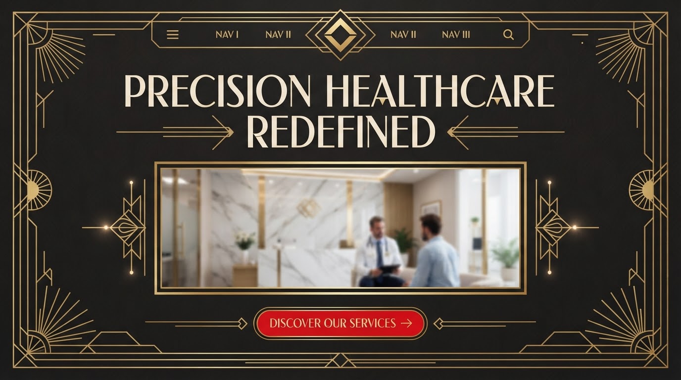
Art deco: high-contrast display type, bracket serifs, ruled lines and geometric motifs, with gold over ink and red reserved for the reservation moment.
The build
Key screens, responsive, motion
Key screens
Home, menu, reservations, private events, location and a gallery — eleven templates sharing one frame.
Responsive
The reservation module sits inline on desktop and becomes a full-screen sheet on mobile, keeping the form fields thumb-reachable.
Motion
Measured fades and a slow marquee of the night's specials that pauses on hover — elegant, never frantic.
The results
What changed, measured
·
·
Client
In their words
“Every detail felt deliberate. Our site finally looks like the brand we always said we were.”
Takeaways
What we'd keep
- 01Centring the reservation flow turned the whole site into a booking surface.
- 02Art-deco framing made the menu feel curated instead of listed.
- 03Cutting the third-party dependency changed the unit economics per cover.
Next case study
A complex platform explained in a single scroll.
Noorus · SaaS & Technology · 2023