Doubled qualified leads for a lending product.
Kasaia is a lending product whose old site looked like every other lender — and earned the same trust as none of them.
The brief
What the client came with
Kasaia is a lending product whose old site looked like every other lender — and earned the same trust as none of them.
The challenge
The design problem to solve
Build trust fast enough that a visitor shares the details a quote requires — on a page that still has to be fast and legible.
The approach
Research, wireframes, style
Research
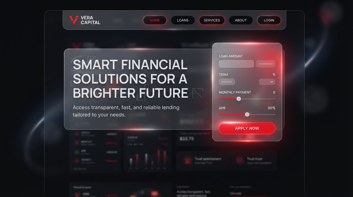
We reviewed every form abandonment and rebuilt the quote flow around the three fields that actually predict a qualified lead.
Wireframes
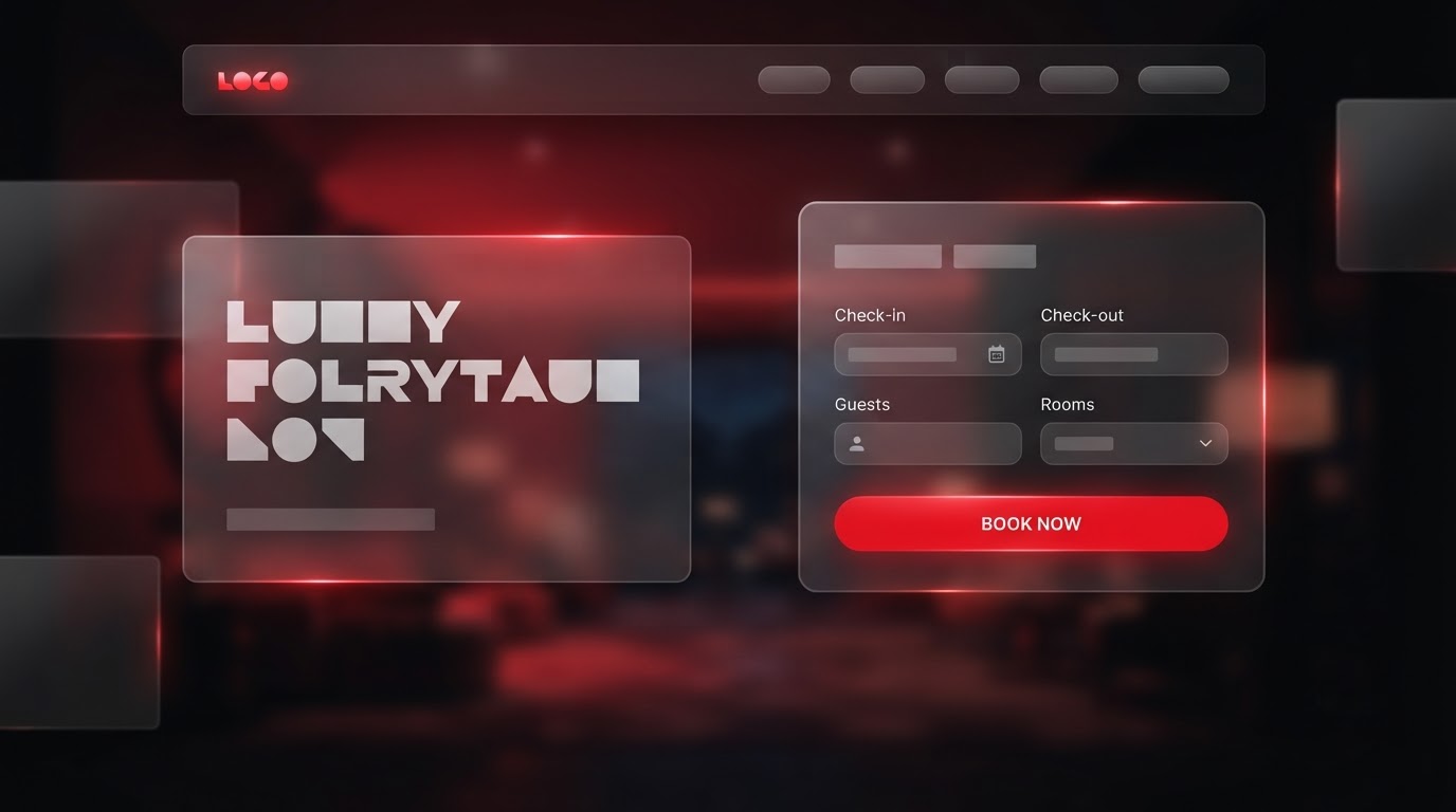
Frosted panels floating over a blurred colour field, with the quote form centred and always in view.
Style exploration
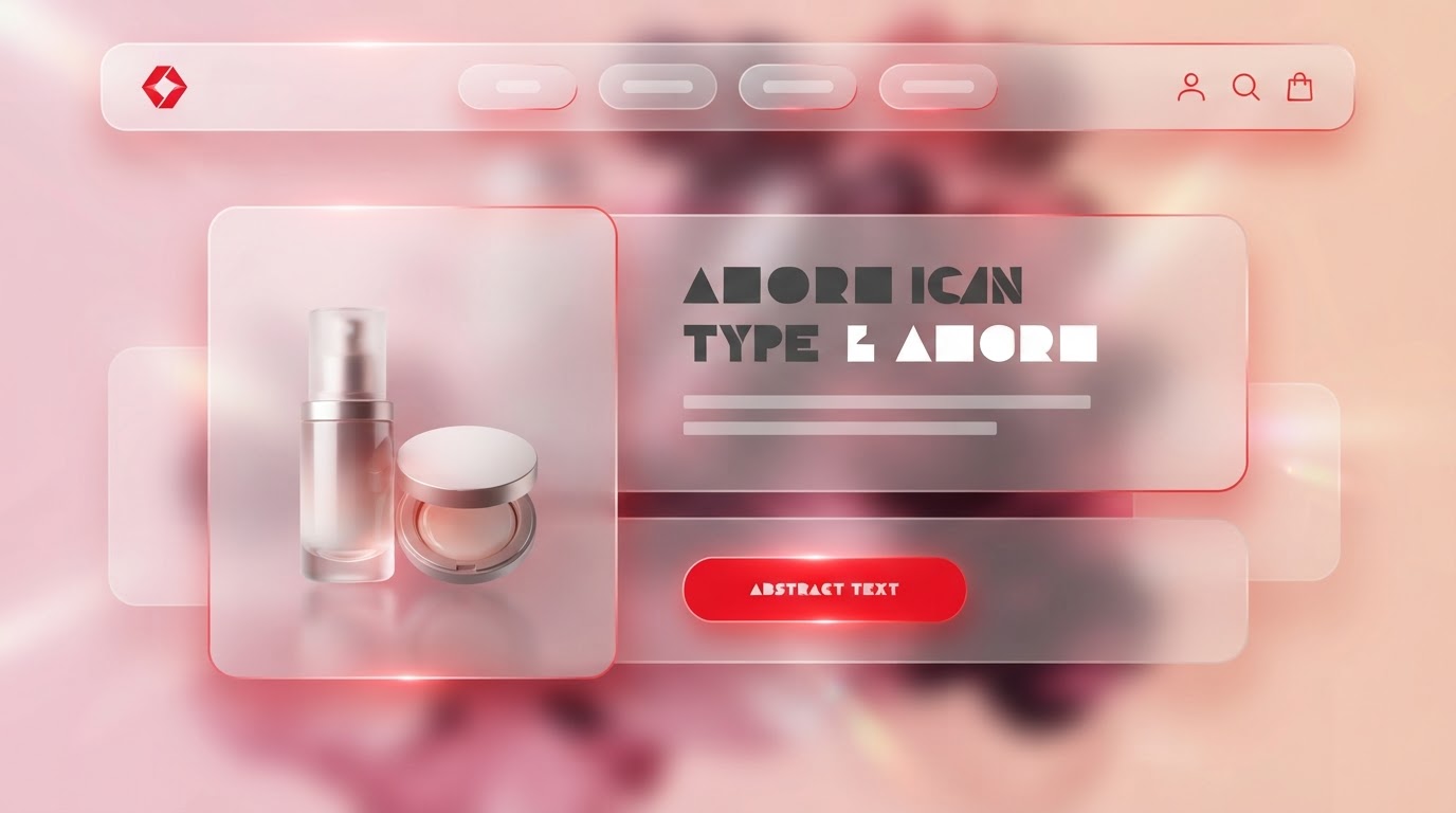
Glass and glow: translucent layers, a geometric display, and red light bleeding through edges to signal the action.
The build
Key screens, responsive, motion
Key screens
Home, how it works, quote, eligibility, FAQ and a member portal — twelve templates.
Responsive
The quote form becomes a step sheet on mobile, one field per screen, so completion never feels like work.
Motion
Blur-in reveals and glowing hover states that make the form feel alive without distracting from it.
The results
What changed, measured
·
·
Client
In their words
“We look like the premium brand we always charged for.”
Takeaways
What we'd keep
- 01Reducing the quote form to three predictive fields doubled qualified leads.
- 02Glass-and-glow surfaces signalled care where lenders usually signal cost.
- 03A step-by-step mobile flow lifted completion from the first week.
Next case study
Patients routed to the right clinic, fast.
Mesain · Healthcare · 2021