A complex platform explained in a single scroll.
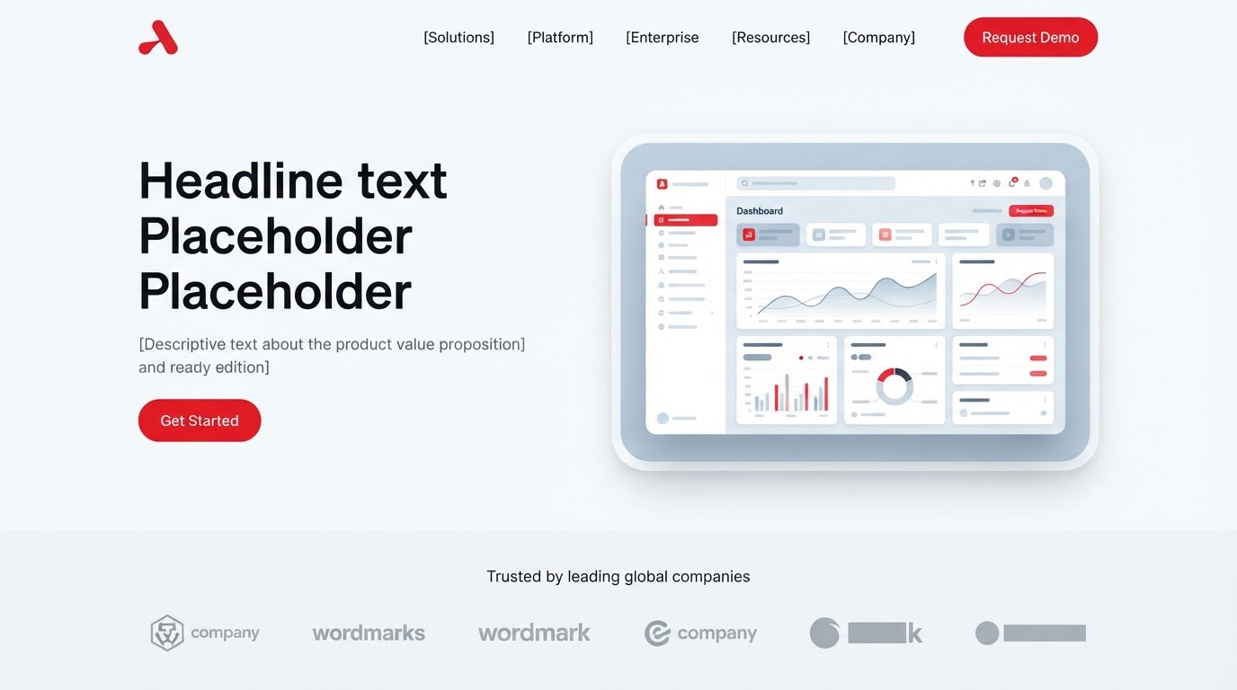
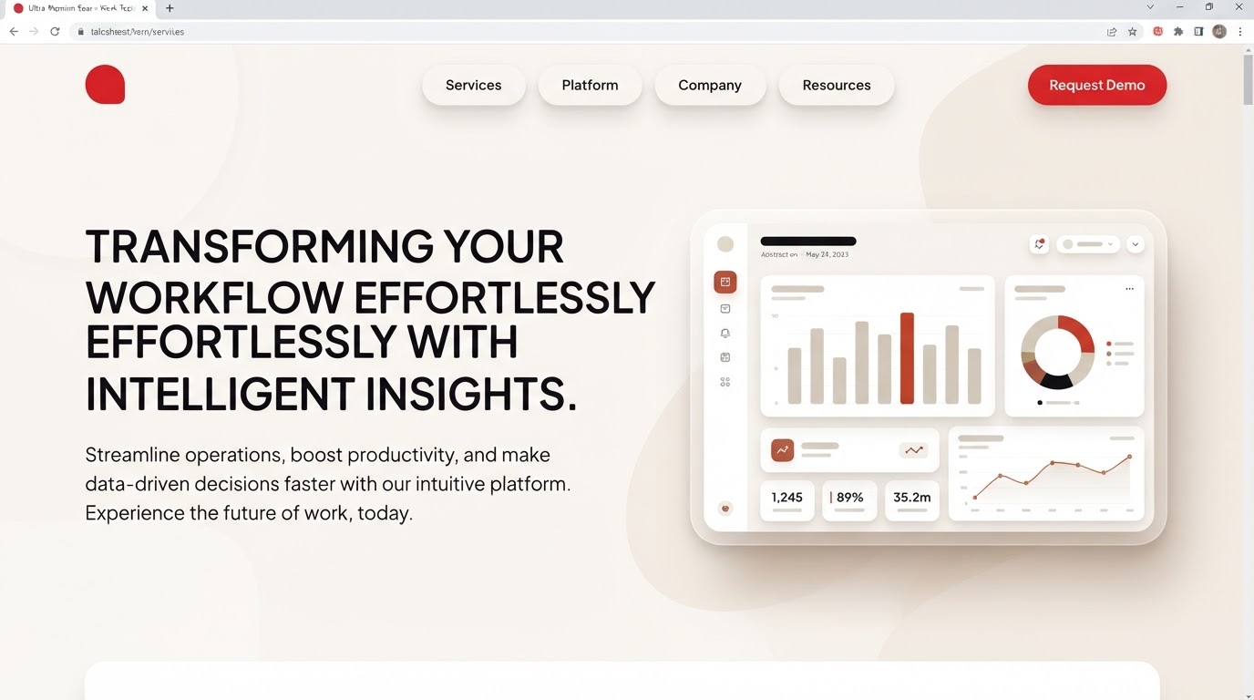
Noorus sells a platform most people couldn't describe in a sentence. The previous site led with features and lost visitors before the value landed.
The brief
What the client came with
Noorus sells a platform most people couldn't describe in a sentence. The previous site led with features and lost visitors before the value landed.
The challenge
The design problem to solve
Translate a deep, technical product into something a first-time visitor understands in seconds — and make the trial the obvious next step.
The approach
Research, wireframes, style
Research
We sat with the sales team and mapped the three questions every prospect asks first. The site answers those before the fold.
Wireframes
An eighteen-page narrative: problem, mechanism, proof, then trial — each section one idea, one image.
Style exploration
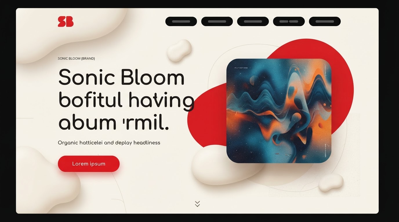
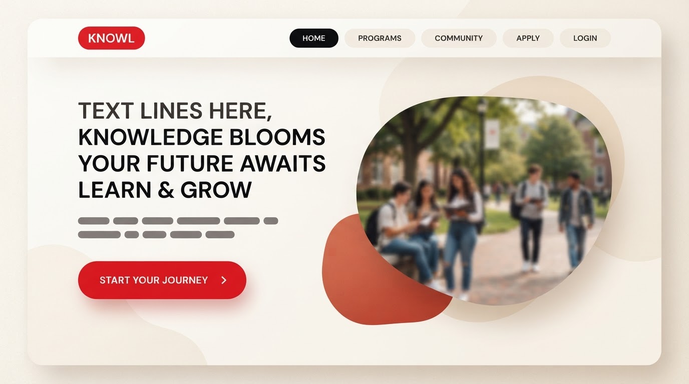
Organic and tactile: soft asymmetric shapes, rounded containers, a humanist display, and warm neutrals with an earthy red accent.
The build
Key screens, responsive, motion
Key screens
Home, how-it-works, pricing, docs hub, changelog and a multilingual EN/AR switch — one system across eighteen templates.
Responsive
Diagrams reflow from side-by-side to stacked on tablet, and the nav collapses into a guided sheet on mobile so the structure survives.
Motion
Soft organic easing and floating accent shapes that respond to scroll without competing with the content.
The results
What changed, measured
·
·
Client
In their words
“Clear, fast and unmistakably ours. Enquiries got sharper and faster from week one.”
Takeaways
What we'd keep
- 01Leading with the three core questions lifted trial signups.
- 02A one-idea-per-section rhythm made a dense product legible.
- 03Bilingual structure let the same story serve two audiences.
Next case study
A heritage label, made modern, editorial and shoppable.
Helora · Fashion & Apparel · 2022