A heritage label, made modern, editorial and shoppable.
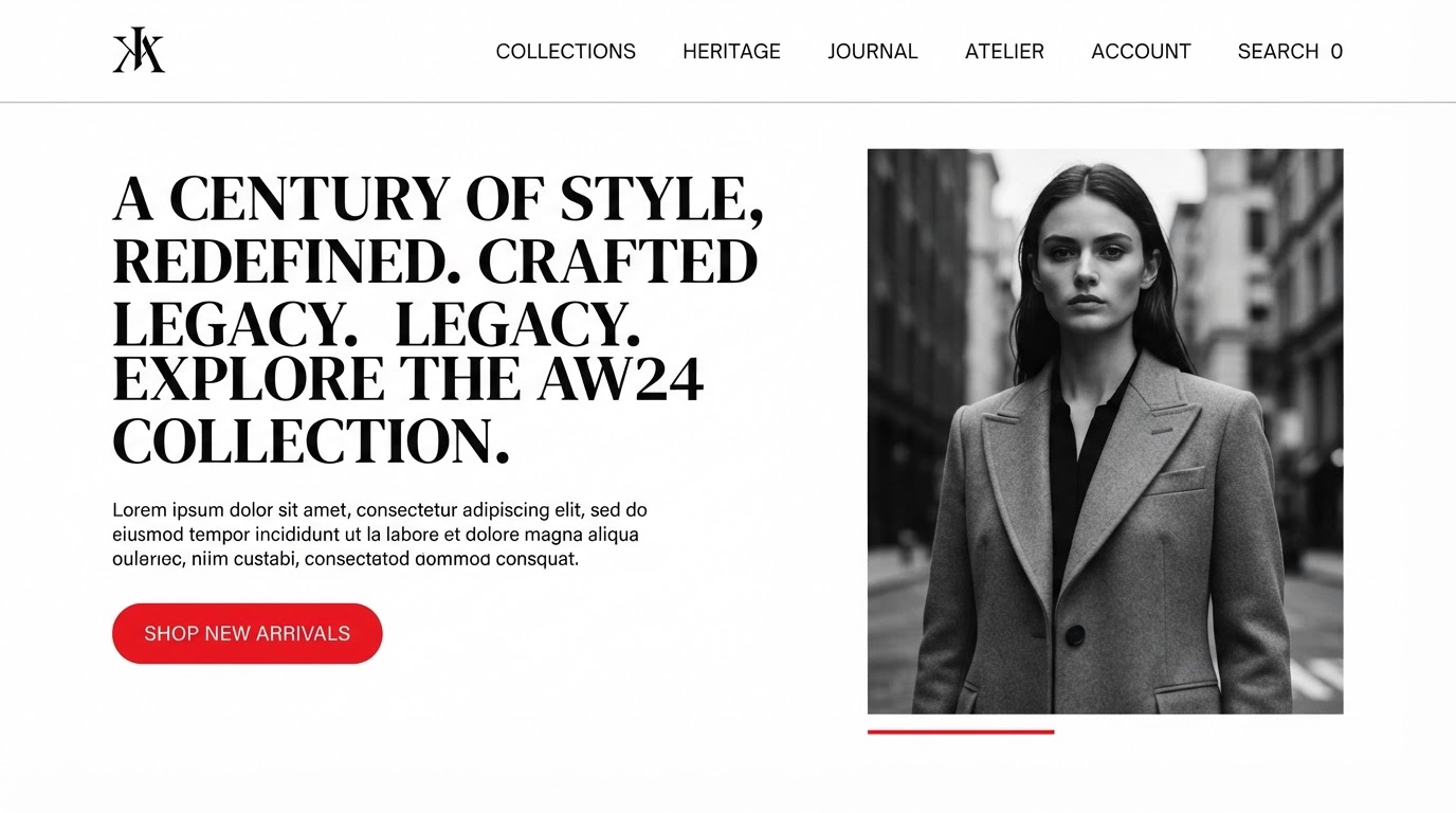
Helora is a heritage fashion house whose online store felt like a catalogue. The brief was a storefront that read like a magazine and sold like a shop.
The brief
What the client came with
Helora is a heritage fashion house whose online store felt like a catalogue. The brief was a storefront that read like a magazine and sold like a shop.
The challenge
The design problem to solve
Honour the label's archive while making the product the hero — and keep the store fast enough that browsing never stalls.
The approach
Research, wireframes, style
Research
We walked the archive and the lookbooks with the team, then mapped which pieces sold and which only got admired. The site had to do both.
Wireframes
An editorial homepage flows into seasonal stories, which flow into the shop — one continuous reading surface.
Style exploration
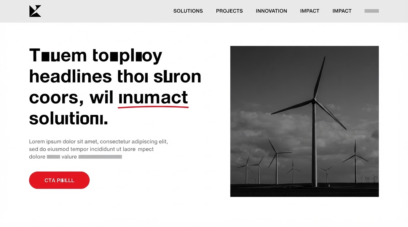
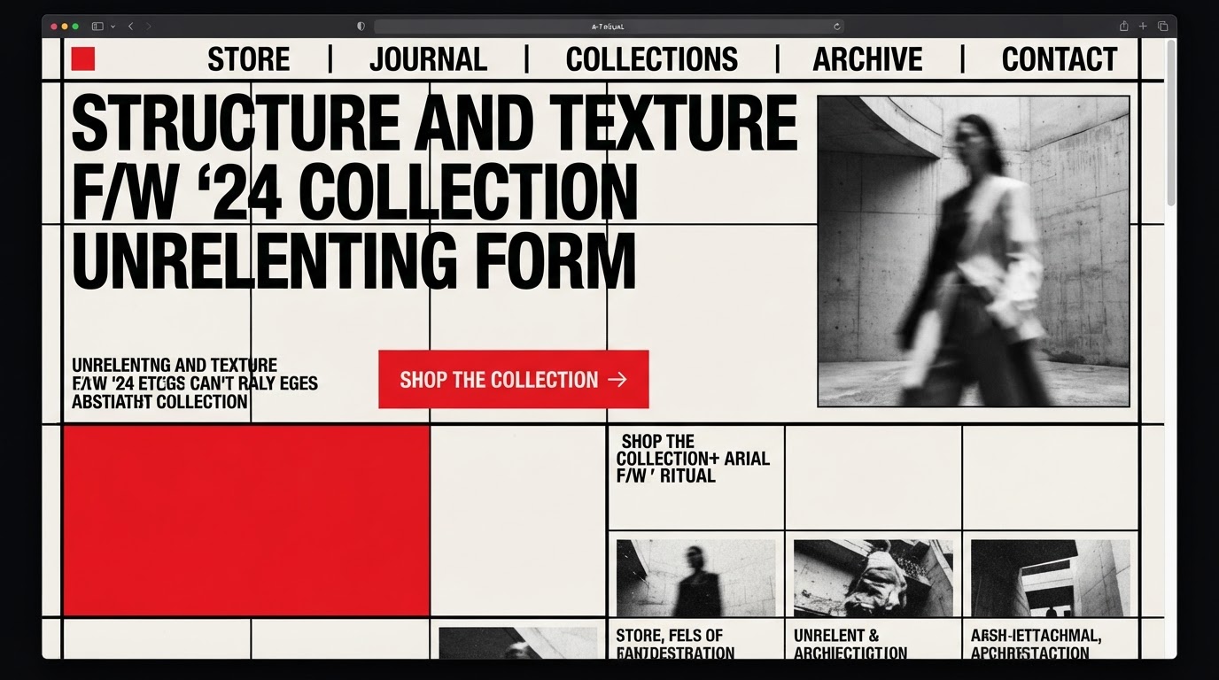
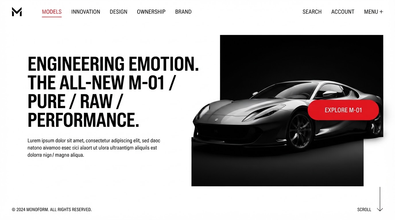
Monochrome: a strict value study in black, white and grey, with red as the sole interaction signal and a single type family across every weight.
The build
Key screens, responsive, motion
Key screens
Home, collections, stories, product detail, membership and checkout — twenty-five templates.
Responsive
The story grid becomes a single column on mobile and a two-up reading flow on tablet, keeping the editorial rhythm intact.
Motion
High-contrast wipes and crisp reveals that snap content into place — no softness, all intent.
The results
What changed, measured
·
·
Client
In their words
“The redesign paid for itself before the quarter closed.”
Takeaways
What we'd keep
- 01Editorial storytelling lifted time on page and repeat visits.
- 02A strict monochrome system kept the archive and the shop on one voice.
- 03Performance work kept a media-heavy store quick to browse.
Next case study
A portfolio that projects scale and precision before the meeting.
Ortina · Architecture & Interiors · 2021