A roastery, turned into a repeat subscription brand.
Dunee House roasts coffee and sold it one bag at a time. The brief was a storefront that made a subscription the obvious choice.
The brief
What the client came with
Dunee House roasts coffee and sold it one bag at a time. The brief was a storefront that made a subscription the obvious choice.
The challenge
The design problem to solve
Move a transactional roastery toward a recurring relationship — without making the shop feel like a commitment trap.
The approach
Research, wireframes, style
Research
We mapped which beans drove repeat orders and built the storefront around those origins, not the full catalogue.
Wireframes
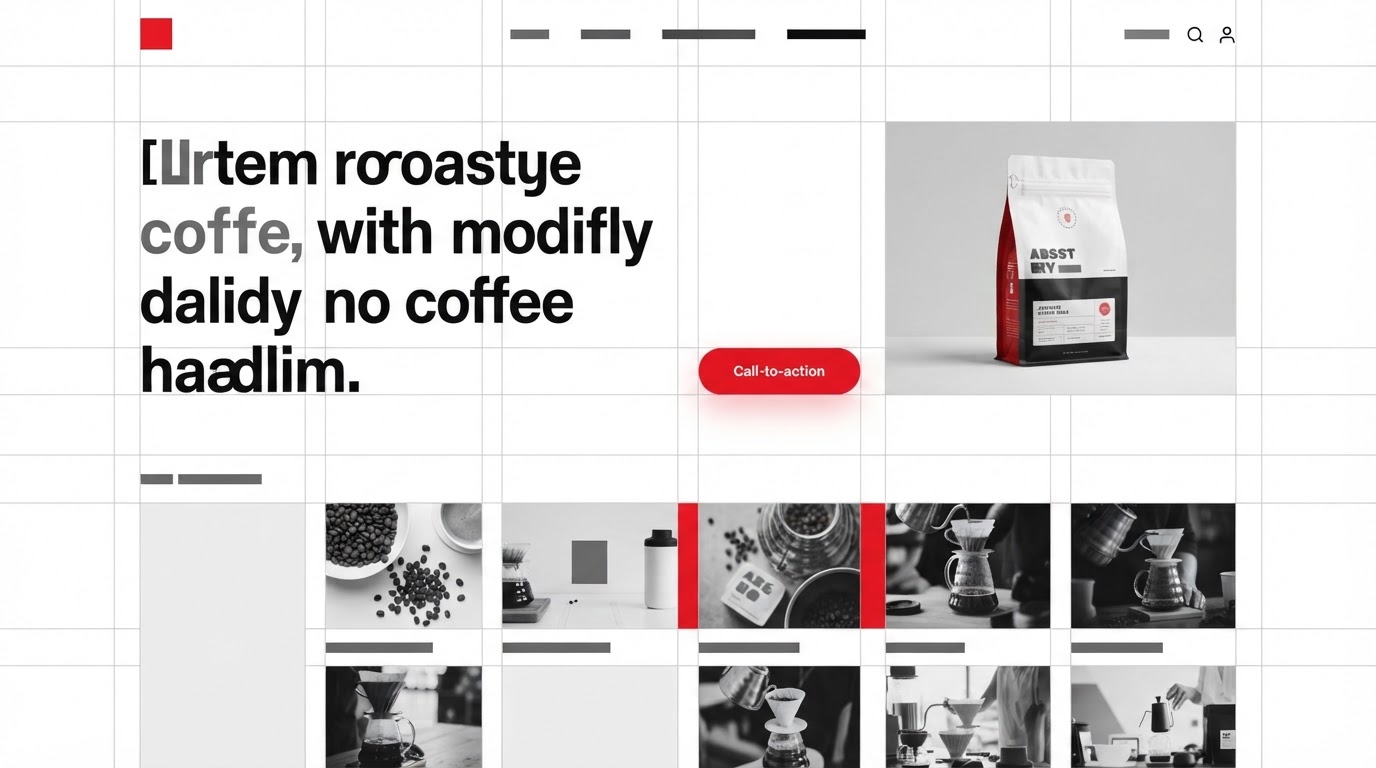
A rigorous modular grid with a subscription module living at the centre of the home fold.
Style exploration
Swiss grid: a neutral grotesque, strict baseline alignment, ink-and-paper palette, red as the only accent.
The build
Key screens, responsive, motion
Key screens
Home, shop, subscription, origin story and a member portal — five templates on a tight grid.
Responsive
The grid snaps to a single column on mobile but keeps its rhythm — the subscription module never demotes.
Motion
Grid-locked reveals that snap content into place, reinforcing the precision of the brand.
The results
What changed, measured
·
·
Client
In their words
“Our trial signups doubled. The team treats the site like a product now.”
Takeaways
What we'd keep
- 01Centring subscription changed the roastery's recurring revenue base.
- 02A strict grid made a small catalogue feel considered.
- 03Performance kept the storefront quick enough for repeat browsing.
Next case study
Doubled qualified leads for a lending product.
Kasaia · Financial Services · 2022