← All 100 websites
Fashion & Apparel/Monochrome/New build
Rivae
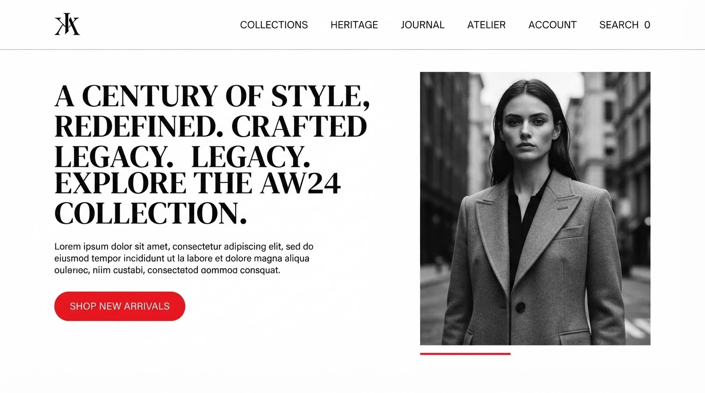
A storefront that made a heritage label feel modern, editorial and shoppable.
rivae.ae
The challenge
An aging website for Rivae buried a strong offering under slow pages, unclear navigation and a brand story that never quite landed online. The priority was to make the work unmistakable in the first scroll and effortless to act on.
The design solution
Layout
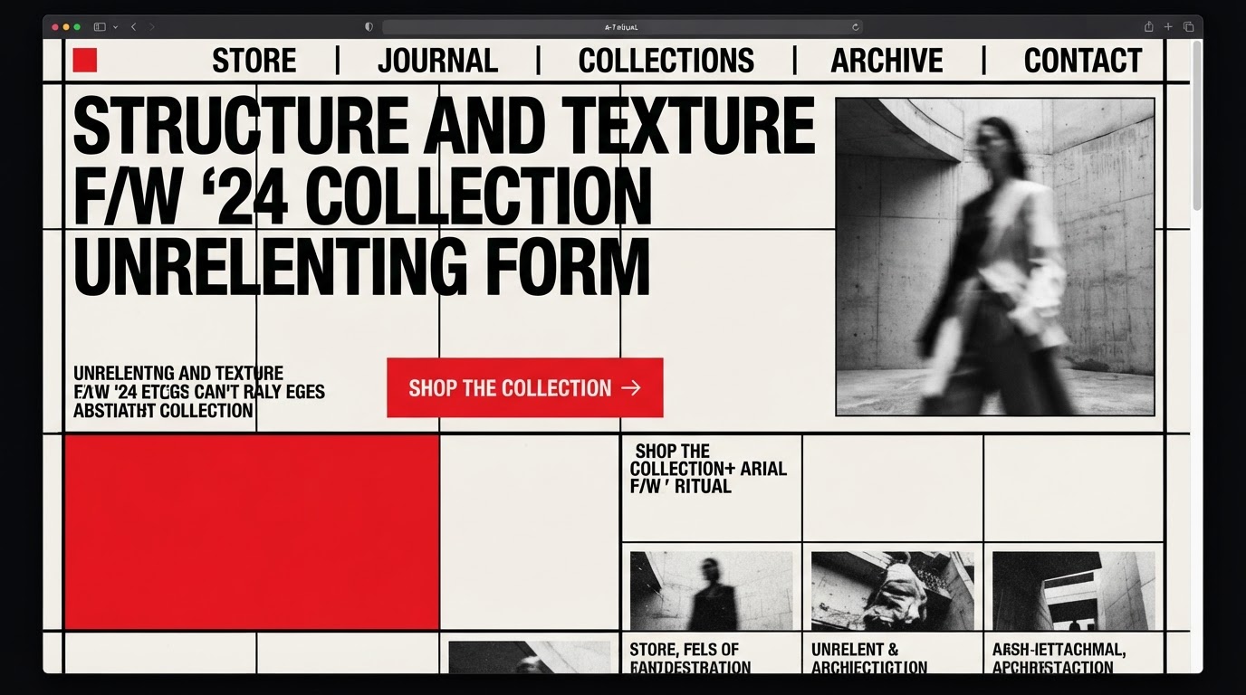
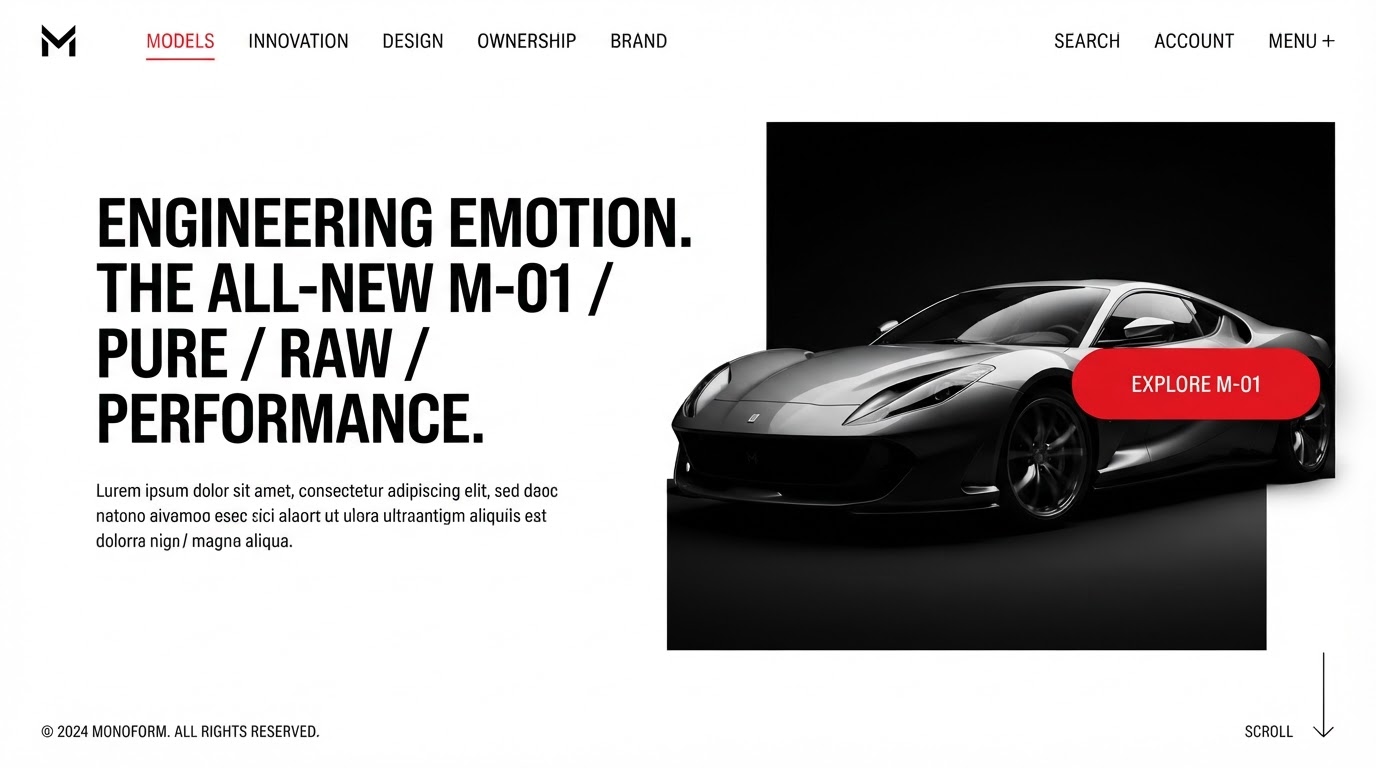
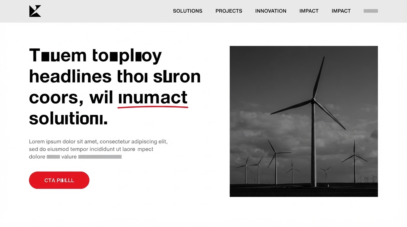
A strict value study in black, white and grey with red as the sole signal.
Typography
A single family used across weights to carry the whole hierarchy.
Colour
Grayscale with red reserved for interaction only.
Motion
High-contrast wipes and crisp reveals.
Features built
- Responsive design
- Scroll storytelling
- CMS integration
- Membership portal
- Accessibility (WCAG AA)
- Performance optimisation
Verified results
·
·
Client quote
“Every detail felt deliberate. Our site finally looks like the brand we always said we were.”